Patrick J. Lynch has been putting his technological expertise and artistic talent to good use at Yale for nearly 27 years. For most of that time, he worked in the School of Medicine's Biomedical Communications Department, which serves the school's audio-visual needs. There he tackled everything from creating medical illustrations for physicians to developing high-tech CD-ROMs for medical personnel.
Today, he is design director for the Center for Advanced Instructional Media, where he is devising new ways to use multimedia technology for medical teaching. He is coauthor -- with Sarah Horton, multimedia applications specialist in curricular computing at Dartmouth College -- of the book "Web Style Guide: Basic Design Principles for Creating Web Sites," being released this month by Yale University Press. Lynch's illustrations of birds appear in the textbook "Manual of Ornithology: Avian Structure & Function" (coauthored with Noble S. Proctor), which the Yale University Press published in 1993. He is now collaborating with Proctor on a field guide to the creatures of the New England shoreline, also for the Yale Press.
The book came about because the web site came about. When Mosaic, which was the first practical graphic web browser, came out back in 1993, people were interested in making World Wide Web sites. Since we had done a great deal of work with CD-ROMs and other multimedia projects, we were giving a lot of advice to people about building web pages, particularly the user interface to web pages. It struck me that, rather than do that over and over again, the logical thing to do was to make a web site [info.med.yale.edu/caim/manual] . That site went up in early 1994. After it had been there several years, an old friend who used to work here, Sarah Horton, and I were talking about web design problems in general, and we both became interested in communicating what we thought we'd learned. Sarah's up in Dartmouth, which is four or five hours away, but because of the web, we were able to collaborate on the guide very easily.
A lot of people start out assuming that the differences are so major that they can freely ignore a lot of the precedents already in place in print. I think our design is unique in trying to incorporate as much as possible the standard print conventions that most people take for granted. People don't normally think about books as having a "user interface" because they've been using them since kindergarten and take them for granted. There is a lot of stuff that has new and fancy names on the Internet, but that has been in "The Chicago Manual of Style" for 25 years. As much as possible, we incorporate standard sorts of print idioms and conventions because people understand them already.
Things as basic as titles. What's the topic of this page? Titles ... dates of documents ... the provenance of a document -- who's saying this to me? That's extra important on the web these days, because there are so many sites now; you have to be careful that you know who's talking to you. That's particularly true in our area, with health information, because there's a lot of garbage on the web, and it can be very, very difficult to tell the difference.
People forget that, even in internal University documents, knowing when something was last changed is important. People tend to print out long documents. Then there are potentially two different versions of a document -- the online one, which may have changed, and the off-line one, which people might think is still the same.
One of the most important things is to know your audience. Right now, we're in the midst of redesigning the School of Medicine web site, and the first thing we considered was: Who are we talking to? Very quickly it became clear that we had two different audiences, external and internal. People coming in from outside the University may only have the vaguest clue of what the Yale School of Medicine is about and, therefore, need an introduction to it. On the other hand, we have a large internal audience, which does not want welcoming statements, but may just want to know who to call to get a new network line. Very different audiences, very different needs.
It also pays to take a fairly broad view, not only of your own web site, but how your site fits within the context of the institution. You can create the most killer web site in the world, but if it doesn't look like it has any relation to the larger institution, it's confusing for the user. This doesn't mean that all web sites have to look the same. At Yale, for example, you would need to consider whether there are landmark links to things like the University's home page, or to your school or department. You have to remember that people may have come into your site from literally anywhere on the web, so they need to have a sense of having arrived at a place that is Yale University, so they know who's talking to them.
When they start a web planning project, people tend to get obsessive about the home page. And that's a big mistake. What's much more important is to consider what the standard template is going to look like for all the internal pages, and then make the home page a derivation of that. The home page is very important, but it's inherently a singular problem. Whereas, if you screw up the template for your internal pages, you could have thousands of problems very quickly.
It happens all the time: People create web pages with no link back to anything else. A web page may be a very valuable document, and there may be other valuable documents around it. But if a user goes to Yahoo!, types in a key word and hits the document, and there are no links to anything around it, it's a dead-end. An experienced user might know enough to play around with the URL to try to find the home page, but it can be pretty frustrating if a user hits a document and knows there are probably other relevant documents there, but can't get to them because there are no links.
Being considerate has to do with carefully planning the interface to your site, for example, so that you don't confuse the consumers, which I define as the people who read it. You need to look carefully at what their needs are. When an institution sets out to describe itself, very often the knee-jerk reaction is to put the organizational chart on the home page. But the consumers may care more about the institution's services and only incidentally about how it is organized.
You also need to be consistent, so that when users are navigating around your site, they find a cohesive and well-planned set of information and not a haphazard "garage sale" of stuff that's been dumped on the web. Garage sales tend to be the norm, unfortunately.
Every time a user has to stop and wonder "How do I get back home? How do I find the menu? How do I search?" it adds a little bit of friction to the process. While any mistake may not be fatal, the gradual accumulation of friction and confusion can mean that users just throw up their hands and go somewhere else.
Any design project should center around the needs of your users. The problem is, users are very rarely at these design meetings, and so very often their needs can get overlooked.
When the web first came out, it was used primarily by people who were already very savvy about computers and the network. So, when a new version of a browser came out, you could count on the new technology getting propagated out onto the web very quickly. Today, those using the web aren't necessarily very expert at the computer. Many web users probably got their browser because it came with the computer when they purchased it, and they may not have the latest versions of browsers. Ironically, from a design point of view, we have to be much more conservative about throwing a lot of technology onto our web sites today.
Also, web use is a lot more practical these days. In the past, there was a lot more surfing, or net voyeurism. Now the typical people who visit our sites at the medical school are looking for something very specific. They're not surfing. They found us either by a search engine or the name of the institution, and they want some specific piece of information. They're not there for "edu-tainment."
Again, it depends on your audience. Multimedia is far from being the easy, natural medium that TV is, so at the medical school we very rarely use it on sites designed for an external audience. On the other hand, we've done much more ambitious things in medical teaching that use fairly large graphics as well as video. But, there, the presumption is that we're talking to people at other peer institutions who are hardwired onto the web at a reasonable bandwidth, say ethernet or better. In that instance, when we've defined our audience very carefully, there's much more flexibility.
Because you pay a "penalty" in longer download times when you use multimedia, you ought to tell the users exactly what they're going to get and get them committed to it. My strategy, therefore, would be not to throw multimedia features up on the front of your web site, because that may result in instant frustration and instant rejection. Once you've convinced people that what you have to offer is interesting, then they will be a lot more patient with a long download time because they're motivated.
That said, it is possible to use video and audio on the web, albeit not at the rate everybody wishes. And if you're planning a long, multi-year effort, remember that technology does change, so things will get better. Eventually the web will be, in terms of its audio-visual aspects, not much different than TV. Practically speaking, for the broad general audience, that's still about 10 years out. But it will come much sooner in offices and academia -- I would say, probably five years from now.
Not emphasizing the planning stage as much as you should. Most people could benefit a lot from making a hierarchical chart of their current web site and looking it over to make sure that they really have an interface and not just a haphazard collection of links, and to consider how their web site might grow in the future. The trend now is to take as much stuff as possible off paper and put it on the web, which means you're eventually going to need an organization. Establishing a web site can be like buying a brand new file cabinet and forgetting that you need folders and tabs and dividers. It will hold just as much if you throw everything in willy-nilly, but you're never going to be able to find anything.
-- By LuAnn Bishop
T H I S
Bulletin Home
How did the "Web Style Guide" come about?
What are the major differences in designing for print
and designing for the web?
What do you mean by print idioms?
In the "Web Style Guide," you're adamant about the need to date web documents. Why?
What do you need to consider when planning your web site?
What about the web site's home page?
You warn in the guide against creating "dead-end" web sites. What are they?
You tell web designers to "be considerate of the consumer." How?
How has the explosion of interest in the Internet affected web site design?
When planning your web site, how much should you use the new multimedia technologies?
If you do decide to use multimedia, what is the best way to do so?
Finally, what is the biggest mistake that you can make when designing a web site?
 W E E K ' SS T O R I E S
![]() Yale study finds Elder Life Program helps curb 'downward spiral' . . .
Yale study finds Elder Life Program helps curb 'downward spiral' . . .
![]() U.S. Surgeon General to speak at Medical Library
U.S. Surgeon General to speak at Medical Library
![]() Yale rower breaks world record (for the fifth time)
Yale rower breaks world record (for the fifth time)
![]() A Conversation With a Master of the Web
A Conversation With a Master of the Web
![]() 'From Bojangles to Broadway' exhibit celebrates black musical entertainers
'From Bojangles to Broadway' exhibit celebrates black musical entertainers
![]() Director will bring his 'unique insights' to 'The Glass Menagerie'
Director will bring his 'unique insights' to 'The Glass Menagerie'
![]() Campus conferences will examine issues related to AIDS
Campus conferences will examine issues related to AIDS
![]() Yale's 'winningest' women's basketball coach stepping down
Yale's 'winningest' women's basketball coach stepping down
![]() Yale is first site in state to offer new test for cervical cancer risk
Yale is first site in state to offer new test for cervical cancer risk
![]() Barbara J. Bachmann, microbiologist and longtime Yale affiliate, died Jan. 31
Barbara J. Bachmann, microbiologist and longtime Yale affiliate, died Jan. 31
![]() Campus Notes
|Visiting on Campus|Calendar of Events|
Bulletin Board
Campus Notes
|Visiting on Campus|Calendar of Events|
Bulletin Board
Classified Ads|Search Archives|Production Schedule|Bulletin Staff
Public Affairs Home|News Releases|E-Mail Us|Yale Home Page
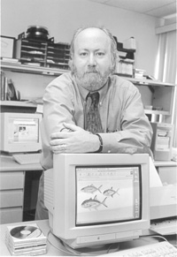
PHOTO BY MICHAEL MARSLAND
| Patrick J. Lynch
| |